Monday, 9 February 2015

Graphic Narrative

What song lyrics have you chosen? Why?

I have chosen to use the song ‘Demons’ by Imagine Dragons for my Graphic Narrative project. I wanted to use this song because I think that whatever way you interpret them, whether literally or figuratively, they tell a story. I wanted to use a couple of lines from the song as opposed to all of it, and while they don’t go in the order that they do in the song itself, they are the lyrics that I had the most ideas for.

What format will your Graphic Narrative take?

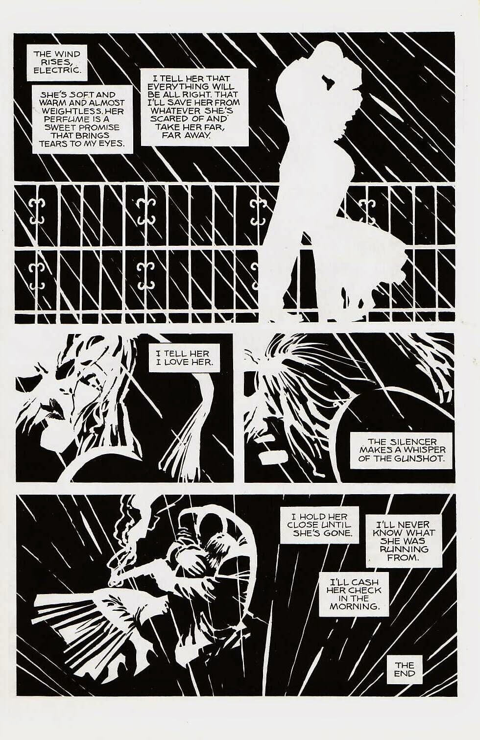
My graphic narrative will be in the form of a comic book. I've started by drawing it all by hand, but I'm going to scan it into illustrator to edit it and make it look more like a comic strip. The style of the comic will be inspired by Frank Miller’s Sin City artwork. There will be six scenes and they will be almost completely in black and white, except for one piece of bright colour, like red or yellow.

How will you change your script to make it more modern, historical or futuristic twist to your script, illustrating a mood/style or intended target audience?


Even though it’s mostly hand drawn, I want my work to be in the style of a comic book, so I am going to use adobe illustrator to sharpen it and make it look more like a genuine comic. I am also going to use mostly black and white in each scene, and only use colour on one particular part to emphasise it more. The background of each picture will be black and everything else will be in white, for example silhouettes and rain. I think this colour scheme will make the work look more modern and so more appealing to the targeted audience, which will be teenagers. I also think having the comic in black and white will help to convey the mood of the song itself, which is quite sad and dramatic. 


Friday, 16 January 2015

Researching Graphic Designers: Frank Miller

'As a cartoonist, I'm a caricaturist. First you find out what somebody looks like, then you find out what they really look like'


FRANK MILLER


Frank Miller is a 58 year old American writer, artist and director. Born on 27th January in Olney, Maryland, Miller is one of seven children. Frank Miller is best known for his comic book stories and graphic novels, with some of his most popular work including; The Dark Knight Returns, 300 and Sin City

SIN CITY


Miller's 'Sin City' artwork is one of my favourite pieces that he has done. Almost all of the comic is in black and white but seems to have a reverse effect where the backgrounds are black and the drawings are in white. I really like this monochrome style because I think it not only suits the typical comic book style, but is also very recognisable as a piece of Frank Miller's work. I also think that this helps to convey the mood of the story itself, which is quite dark and dramatic. For the most part, Miller's art is of a very basic colour palette, however in some places he does use one very bold colour, for example the Sin City tile is always written in red and I think this just as effective as having everything in black and white. I think the one splash of colour helps to make the story more dramatic. The boldness of the red also helps to make the artwork more identifiable, as one of the most recognisable things about the Sin City comic is the black, white and red colour scheme. 


Monday, 12 January 2015

Graphic Narrative Production - Ghostbusters


The comic was written by Erik Burnham, the artists were Dan Schiening and Doc Shaner, and the colours were by Luis Antonio Delgado.


The majority of the colours in the book are quite basic colours- there is a lot of reds and yellows used in there, for example in scenes with fire and explosion, and in some of the scenes the characters faces are red to show that they are angry. In scenes where they are outside or in a colder temperature the artist uses the colour blue, which really helps to set the scene. 


The typeface used is actually called 'Ghostbusters' and is unique to the comic books. On the front cover it appears in black, however the O in ghostbusters is the ghostbusters logo, which is iconic and known by many people and makes it even clearer that the comic is a Ghostbusters one. The font itself is quite big but when it is on the page with everything else it's not the first thing your eye is drawn to- it isn't the focus point of the page. The colour of the text is just plain black but it has a white outline that has been blurred to make it look like it's glowing, which I think really fits in with the theme of the comic. I think it fits in because the 'Ghostbusters' narrative is centred around paranormal and science fiction things, so I think the use of shadowing really helps to cement the this. 


The use of images in the narrative are hand drawn and have a 'dream like' quality to them. The colours in the background are not in a block formation, they all blend into each other almost like a gradient, which makes it look a bit fuzzy and dreamy. Different images have been combined together to portray a certain part in the story. Although the images were most likely hand drawn to begin with they have been scanned into a computer and manipulated to make them look more like a comic. For example, the characters themselves have been edited using a computer to make them more crisp and clear, rather than looking hand drawn which can sometimes appear as quite scruffy and amateur. Personally, I think the right amount of images have been combined together to tell the story. The style of the narrative means that it would be quite easy to overload an image with different elements to make it look cluttered and as though there is too much going on, but I think the artists have used the right amount of images, I think if they had used any less the images may have appeared quite empty and like they have a lot of wasted space. 


Although there are different stories told, I think the emotion of the Ghostbusters comics is quite humorous. It is meant to be light hearted and has quite a large fan base that spans from young children to middle aged men, so the narrative has to be kept quite light and fun. 


Monday, 15 December 2014

Guess Who

We had to take a picture of ourselves and edit it to make it look like a character from the Guess Who game. We had to edit the picture bit by bit and make it look like a cartoon icon, which would fit onto the board.

The first thing I edited was my eye brow. I used the pen tool and zoomed right into my eyebrow and traced around it. I then used the eye dropper tool to match it with my hair.


I used the circle tool to try and re-create my eye in a cartoon version.

Then I started to re-create my eyes. I drew a white oval and sent it to the back, before drawing 4 circles and arranging them so that they looked like eyes. After that I used the pen tool to draw eyelashes, and then copy and pasted them to fill out my eye. 


I carried on with the rest of my face, colouring in my hair and adding more details to my face. 

Killer Coke


For the first hour of the lesson we watched and took notes on a Channel 4 dispatches documentary about Coca-Cola.


The documentary was filmed undercover and was exposing Coca-Cola for their crimes against nature and humanity. After watching this, we need to create a poster about Coca-Cola, to show what they are actually doing. Before we get around to actually making our poster, we have to do some research and draft some initial ideas. 

Initial Research
These are some posters that I liked the look of and gave me ideas when I first saw them. 


The first poster was the main inspiration for my own poster because I really like the wording on it and also the whole style of it. It is quite a traditional and vintage poster and I think it would look good to try and recreate it in that style but instead it could be advertising 'Killer Cola'. 


My Poster


This is the very first stages of my poster. I'm trying to use the same layout and look as the poster that I got my inspiration from, but rather than having a Coca-Cola factory behind all the bottles, i'm putting a picture of a child cutting down sugar canes, as in the documentary we watched, they visited the sugar plantation that Coca-Cola and found out that they employ children. 


This is my finished poster. I'm really happy with the way it's turned out and how it looks. It doesn't look like an exact copy of the poster it is originally based on, but I still think it's quite effective.  The main colours i've used are Black, White and Red, and the Brown of the coke in the bottles. For the background colour, I used the eye dropper tool to select the background colour of the original poster, because it has an off-white colour that is difficult to mimic in Photoshop, and I think it makes the poster look a little bit worn as opposed to having a crisp white colour as the background. I used a picture of a little boy cutting down some sugar canes because I wanted to make the poster about child labour which was a big part of the Dispatches Documentary we watched in class. The font I used was called 'Rockwell' and it was the most traditional looking text I could find. I chose to go for this because I wanted to keep the poster looking as old fashioned as possible, as I think it makes it a bit more effective and also looks similar to the original. 

I placed the picture of the child towards the back of the poster, because if people were to look at it quickly, the chances are they would see the Coca-Cola logo, and then do a double take as they see the picture. I chose to do it like this because it is more likely to make people think, rather than just going straight for the 'Shock Factor'. 


Friday, 12 December 2014

Unit 19: Digital Graphics for Interactive Media Objectives


Ethical Designer Evaluation

My main influence was Barbara Kruger. I really liked the fact that she had a really basic picture in monochrome colours and then the bold red text over the top, I think it was really effective and i wanted to bring some of that into my design. 
I think the area that needs the most improvement in my advert is the timing. The transitions between the frames are quite slow and the word 'worldwide' seems to be quite jumpy when it comes in. If I were to do this project again I would spend a lot more time perfecting the timings and how smooth the animation is, for example I would make the words in the first couple of frames come in and flow a lot smoother, so that the finished gif would have a more polished look. 

I am very happy with my final outcome, and am happy with the way it has all come together. My initial idea was to have a picture of the world and to have facts and statistics written in bandages, however I do prefer my final animation. I still kept my original idea of having the world in the background, and still kept my inspiration from Barbara Kruger, however I decided to have a bandage over Africa instead, which is one of the countries that Arms Around the Child help the most, and had a plain font that looks as though it has been written using a type writer. I went with this because I wanted to keep it simple, but still effective, and I feel that my final outcome is simple yet effective. 
To make sure that my piece represented the ethical theme, I wanted the base of my animation to be a picture of the world. The reason I wanted this is because Arms Around the Child is a worldwide charity, and i wanted to make sure that this was obvious to anyone who was hearing about the charity for the first time by watching the animation. I also wanted to make sure that Africa had some focus during the piece, which was why I chose to place the plaster/bandage onto Africa. I chose to place it here because although Arms Around the Child helps children all around the world, the majority of their efforts take place in Africa. 

In the future, I will approach projects with a more developed idea of what I want my final piece to look like. The reason for this is because, after looking back at the Arms Around the Child project, I had an idea that I knew I wanted to use, but I hadn't developed it enough to know exactly what I was going to be doing. I think it could have saved a lot of time if I had planned more of what I was going to do, rather than develop it as I go along. 


Arms Around A Child inspired artwork

After writing down my initial ideas I chose my favourite one and developed it more so that it could be made into an advert. My favourite idea was using the world as a basis for the advert and having a fact come in around it.