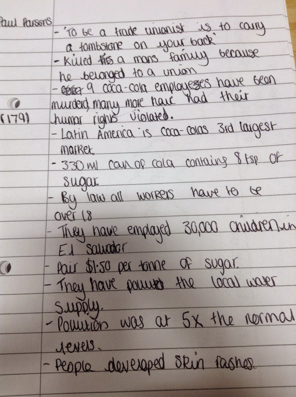

The documentary was filmed undercover and was exposing Coca-Cola for their crimes against nature and humanity. After watching this, we need to create a poster about Coca-Cola, to show what they are actually doing. Before we get around to actually making our poster, we have to do some research and draft some initial ideas.
Initial Research
These are some posters that I liked the look of and gave me ideas when I first saw them.
The first poster was the main inspiration for my own poster because I really like the wording on it and also the whole style of it. It is quite a traditional and vintage poster and I think it would look good to try and recreate it in that style but instead it could be advertising 'Killer Cola'.
My Poster
This is the very first stages of my poster. I'm trying to use the same layout and look as the poster that I got my inspiration from, but rather than having a Coca-Cola factory behind all the bottles, i'm putting a picture of a child cutting down sugar canes, as in the documentary we watched, they visited the sugar plantation that Coca-Cola and found out that they employ children.
This is my finished poster. I'm really happy with the way it's turned out and how it looks. It doesn't look like an exact copy of the poster it is originally based on, but I still think it's quite effective. The main colours i've used are Black, White and Red, and the Brown of the coke in the bottles. For the background colour, I used the eye dropper tool to select the background colour of the original poster, because it has an off-white colour that is difficult to mimic in Photoshop, and I think it makes the poster look a little bit worn as opposed to having a crisp white colour as the background. I used a picture of a little boy cutting down some sugar canes because I wanted to make the poster about child labour which was a big part of the Dispatches Documentary we watched in class. The font I used was called 'Rockwell' and it was the most traditional looking text I could find. I chose to go for this because I wanted to keep the poster looking as old fashioned as possible, as I think it makes it a bit more effective and also looks similar to the original.
I placed the picture of the child towards the back of the poster, because if people were to look at it quickly, the chances are they would see the Coca-Cola logo, and then do a double take as they see the picture. I chose to do it like this because it is more likely to make people think, rather than just going straight for the 'Shock Factor'.


No comments:
Post a Comment