Monday 15 December 2014

Guess Who

We had to take a picture of ourselves and edit it to make it look like a character from the Guess Who game. We had to edit the picture bit by bit and make it look like a cartoon icon, which would fit onto the board.

The first thing I edited was my eye brow. I used the pen tool and zoomed right into my eyebrow and traced around it. I then used the eye dropper tool to match it with my hair.


I used the circle tool to try and re-create my eye in a cartoon version.

Then I started to re-create my eyes. I drew a white oval and sent it to the back, before drawing 4 circles and arranging them so that they looked like eyes. After that I used the pen tool to draw eyelashes, and then copy and pasted them to fill out my eye. 


I carried on with the rest of my face, colouring in my hair and adding more details to my face. 

Killer Coke


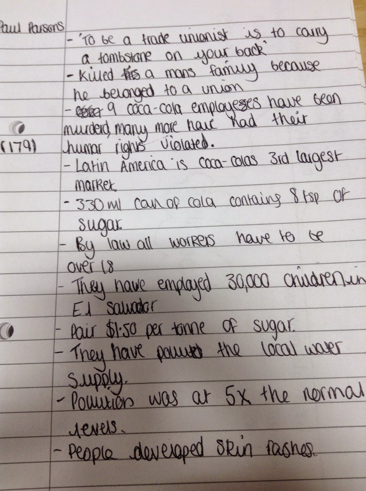
For the first hour of the lesson we watched and took notes on a Channel 4 dispatches documentary about Coca-Cola.


The documentary was filmed undercover and was exposing Coca-Cola for their crimes against nature and humanity. After watching this, we need to create a poster about Coca-Cola, to show what they are actually doing. Before we get around to actually making our poster, we have to do some research and draft some initial ideas. 

Initial Research
These are some posters that I liked the look of and gave me ideas when I first saw them. 


The first poster was the main inspiration for my own poster because I really like the wording on it and also the whole style of it. It is quite a traditional and vintage poster and I think it would look good to try and recreate it in that style but instead it could be advertising 'Killer Cola'. 


My Poster


This is the very first stages of my poster. I'm trying to use the same layout and look as the poster that I got my inspiration from, but rather than having a Coca-Cola factory behind all the bottles, i'm putting a picture of a child cutting down sugar canes, as in the documentary we watched, they visited the sugar plantation that Coca-Cola and found out that they employ children. 


This is my finished poster. I'm really happy with the way it's turned out and how it looks. It doesn't look like an exact copy of the poster it is originally based on, but I still think it's quite effective.  The main colours i've used are Black, White and Red, and the Brown of the coke in the bottles. For the background colour, I used the eye dropper tool to select the background colour of the original poster, because it has an off-white colour that is difficult to mimic in Photoshop, and I think it makes the poster look a little bit worn as opposed to having a crisp white colour as the background. I used a picture of a little boy cutting down some sugar canes because I wanted to make the poster about child labour which was a big part of the Dispatches Documentary we watched in class. The font I used was called 'Rockwell' and it was the most traditional looking text I could find. I chose to go for this because I wanted to keep the poster looking as old fashioned as possible, as I think it makes it a bit more effective and also looks similar to the original. 

I placed the picture of the child towards the back of the poster, because if people were to look at it quickly, the chances are they would see the Coca-Cola logo, and then do a double take as they see the picture. I chose to do it like this because it is more likely to make people think, rather than just going straight for the 'Shock Factor'. 


Friday 12 December 2014

Unit 19: Digital Graphics for Interactive Media Objectives


Ethical Designer Evaluation

My main influence was Barbara Kruger. I really liked the fact that she had a really basic picture in monochrome colours and then the bold red text over the top, I think it was really effective and i wanted to bring some of that into my design. 
I think the area that needs the most improvement in my advert is the timing. The transitions between the frames are quite slow and the word 'worldwide' seems to be quite jumpy when it comes in. If I were to do this project again I would spend a lot more time perfecting the timings and how smooth the animation is, for example I would make the words in the first couple of frames come in and flow a lot smoother, so that the finished gif would have a more polished look. 

I am very happy with my final outcome, and am happy with the way it has all come together. My initial idea was to have a picture of the world and to have facts and statistics written in bandages, however I do prefer my final animation. I still kept my original idea of having the world in the background, and still kept my inspiration from Barbara Kruger, however I decided to have a bandage over Africa instead, which is one of the countries that Arms Around the Child help the most, and had a plain font that looks as though it has been written using a type writer. I went with this because I wanted to keep it simple, but still effective, and I feel that my final outcome is simple yet effective. 
To make sure that my piece represented the ethical theme, I wanted the base of my animation to be a picture of the world. The reason I wanted this is because Arms Around the Child is a worldwide charity, and i wanted to make sure that this was obvious to anyone who was hearing about the charity for the first time by watching the animation. I also wanted to make sure that Africa had some focus during the piece, which was why I chose to place the plaster/bandage onto Africa. I chose to place it here because although Arms Around the Child helps children all around the world, the majority of their efforts take place in Africa. 

In the future, I will approach projects with a more developed idea of what I want my final piece to look like. The reason for this is because, after looking back at the Arms Around the Child project, I had an idea that I knew I wanted to use, but I hadn't developed it enough to know exactly what I was going to be doing. I think it could have saved a lot of time if I had planned more of what I was going to do, rather than develop it as I go along. 


Arms Around A Child inspired artwork

After writing down my initial ideas I chose my favourite one and developed it more so that it could be made into an advert. My favourite idea was using the world as a basis for the advert and having a fact come in around it.


Monday 20 October 2014

Imitating Barbara Kruger

The artist I chose to recreate was Barbara Kruger. I really liked the whole style of her artwork and decided that I wanted to make my own. I haven't used the exact font that she used, and my image is hand-drawn and then eddied using Photoshop, but I tried to do it in the same style as her, with the bold red writing and a black and white image underneath. 

I then added the Arms Around The Child logo to the bottom with the information you need if you want to donate via text.

Friday 17 October 2014

Intial Ideas

We had to design 4 initial posters that were inspired by our chosen artist. I have only designed three, and I really liked two of mine but I'm definitely not going to use my third one.
The artist I chose to use was Barbara Kruger, who's art mostly consists of a black and white image, with a phrase or word over the top, usually in red and in a bold font like 'Helvetica'.


These were my three initial designs. The two I liked are the two that have been painted. I wanted to still do it in the style of Barbara Kruger, and keep the image mostly black and white, with just the red writing over the top. Out of the two, the one I like the most is the one that has the world in black and white, with the red writing over the top. 


I think I like this one the most because it is the most basic out of the tree, but it is still effective and gets the point that I was trying to make across. I am planning to go on and develop this one. 


Friday 10 October 2014

Ethical Designers

Background

Barbara Kruger is a 69 year old American artist, born in Newark, New Jersey. Her art in mostly black and white, and has red wording over the top, often in the 'Futura Bold Oblique' or 'Helvetica Ultra Condensed' fonts. The wording usually has 'you','I','We' or 'they' and address issues to do with power, identity and sexuality. Kruger has often been labeled as a feminist postmodern artist, along with the likes of Jenny Holzer and Cindy Sherman. 


Art


This is a piece of Barbara Kruger's artwork. It's easy to see that it is her artwork, because almost if not all of her artwork consists of black, white and red. The black and white image by itself would be quite plain, but by putting the block red text over the top, she's made the image a lot more powerful and bold. The image is two tone, you have one fairly normal looking black and white side, and then you have a side which looks quite reversed and negative. With the words 'Your body is a battleground', it makes me think of an actual battleground. It reminds me of this because the negative side of the image looks a bit like night vision, which you associate with battlegrounds.

She uses actual photographs in her art, which I think makes it more real and makes you take it more seriously. The photographs have been edited to make them black and white, and I think that the right amount of imagery has been used. If they had used more I don't think the pictures would have had the same effect that they do on people, because they would just be overloaded with pictures and writing. 

The first thing you look at on the pictures is the block red text, and once you have read that you then look at the image behind it. I think that this hierarchy is good because the writing has powerful words and phrases that relate to the images in some kind of way, so if you were to look at the image first it wouldn't make as much sense. 

I think Barbara used computer programmes like Illustrator and photoshop to create and edit the image. I think the most successful piece of the image is the writing, because I think it really helps to convey the message that she wants to get across, but I think one of the reasons that it is so successful is because it is paired with the black and white image behind it, because the image itself is relevant to the writing, but they way in which it has been edited and the fact that it only consists of black and white just makes the whole piece look so much better. 


"I have no complaints, except for the world." - Barbara Kruger.


Monday 6 October 2014

Arms Around the Child


'Arms Around the Child' is a charity  dedicated to helping vulnerable and used children around the world, in their own words they are trying to 'stop the war against children'. Founded in January 2012 by Leigh Blake, the majority of their work takes place in third world countries, like parts of Africa and the Middle East, however they do try to help children all around the world. 
Leigh Blake was inspired to start the charity after meeting Jackie Branfield, who runs the 'Bobbi Bear' organisation in South Africa, and who dedicates her life to rescuing children who have been victims of child sexual abuse, and also after meeting Mum Carol who fosters and supports over 1200 children who are living in parentless households. She provides food parcels, blankets, school uniforms, toiletries and anything else the children may need to survive. 


The charity has both a twitter and a Facebook page, where they post links and updates about up and coming events and fundraisers. On their twitter page, they mostly link their followers to auctions that are giving people the chance to bid on things like singing lessons with Florence & the Machine. By having these social media pages they are connecting with a much wider, much more diverse audience, meaning that they stand more of a chance of getting more donations and people coming to events, and are really just getting their name out there and raising more awareness. They have over 1000 followers on Twitter and almost 2000 likes on Facebook. 


http://armsaroundthechild.org  - This is a link to the organisations website. There is a lot more information on their website, including maps that show you where in the world that there are branches that are helping children. They also show worldwide statistics, stating the numbers and percentages of children that are suffering or living in poverty and the numbers are very shocking. 


Friday 3 October 2014

Photoshop Animations


10 Facts

- Unicorns were mentioned in the bible
-Pound for pound, the average car is cheaper than a hamburger.
-NASA Scientists claim that in 20 years they'll know whether we're alone in the universe or not.
-Pigs can learn how to play video games
-Cows have best friends and become anxious if they get separated.
-Only 10% of the population is left handed.
-