Monday 4 May 2015

Graphic Narrative Evaluation


I really enjoyed doing this assignment. I liked the fact that it lasted over quite a few months so we could spend a lot of time planning and developing our ideas before we actually began. The first thing we did was decide which song we wanted to use and then create a brief storyboard of ideas. I think that this helped with the assignment because it meant that I could draft out any ideas that I had and see whether or not they would work together in a sequence. 

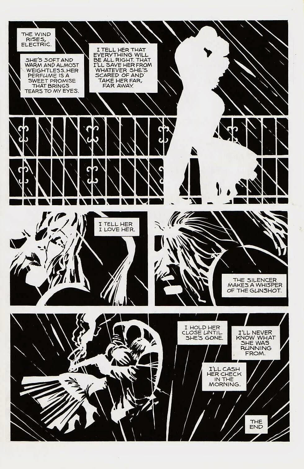
All of the artwork I did for this assignment was hand drawn initially but after scanning in into a computer I used Adobe Illustrator to edit and adjust it. The artist that I researched before the assignment was frank Miller, the artist behind the Sin City comics, which inspired my artwork. I think if I were to make any adjustment next time I would try to use a lot more techniques before editing my work on a computer, for example painting rather than drawing and looking at different textures. I would want to change this because I think that the drawing makes the work look slightly amateur and looks quite unfinished, so I think next time I would create the bases by hand and use Illustrator to create the images as opposed to just editing them. 

Although some of the lines I chose to use are not consecutive in the song, I think that my narrative works and represents the lyrics well.

Monday 27 April 2015

Jack and Jill Narrative

We were given a sheet full of different symbols and pictures and were told we had to use these to make the story of Jack and Jill. The images on there were all quite random but we had to use them to represent different parts in the story.


In the first scene I chose to use a picture of an elephant and a teddy bear to represent Jack and Jill, and also to represent the first line of the rhyme- 'Jack and Jill..'.  I chose to use these because they are quite fun and abstract, but they still represent what is happening.


The next scene is 'went up the hill', for this I used a picture of a finger pointing upwards and a plane. I  wanted to use the pointing finger because it is really obvious that it is pointing upwards and that Jack and Jill went up a hill. I also wanted to use the plane as they also help to represent the direction of 'up'.
The next line in the rhyme is 'to fetch a pail of water'. I chose to use a picture of a fire hydrant and an exclamation mark, because I thought that they were the best images to use to help to show what is happening. 


'Jack fell down' comes after this, and I had a few ideas of how to portray this line but I decided to use a picture of a ladder and a picture of a hand pointing down. I think that these two pictures make it quite obvious that Jack has fallen down. 

After this, the next line is 'and broke his crown'. On the sheet we were given we had a picture of a crown and I wanted to use this and represent the line in a literal sense. I cut the crown in half to show that he had broken his crown, and I also used a picture of the teddy bear that I had used in the first scene to show that Jack had fallen down. 


The last line is '..and Jill cam tumbling after', so I chose to use a picture of the elephant that I used on the first scene, and an arrow pointing down. Again I think these two picture help to make what is happening really obvious, and make it clear that Jill fell down after. 


Monday 30 March 2015

Graphic Narrative: Initial Ideas


This is the story board that I drew in the first stages of the assignment. Once I'd chosen what song I wanted to use and which artist I would draw inspiration from I started to plan out what my artwork would look like. I made the drawings really basic because I wanted to get my ideas down first to see what they would look like on paper, and once I was happy with them I would start to build upon them. The lyrics that are being described in each scene are just above the boxes. 

On the story board in the picture there are six frames, but once I actually started my final designs I decided to just do five because I didn't really have any solid ideas for the last picture and I didn't want to make a really basic one and have it ruin the rest of the narrative. I have also only used colour in a couple of images in here because I wanted to see whether it would look good or whether I should leave it out in my final design. 

I have also decided not to do lines that follow on from one another, but instead do ones that I think could be easily conveyed in the actual narrative.

Monday 9 February 2015

Graphic Narrative

What song lyrics have you chosen? Why?

I have chosen to use the song ‘Demons’ by Imagine Dragons for my Graphic Narrative project. I wanted to use this song because I think that whatever way you interpret them, whether literally or figuratively, they tell a story. I wanted to use a couple of lines from the song as opposed to all of it, and while they don’t go in the order that they do in the song itself, they are the lyrics that I had the most ideas for.

What format will your Graphic Narrative take?

My graphic narrative will be in the form of a comic book. I've started by drawing it all by hand, but I'm going to scan it into illustrator to edit it and make it look more like a comic strip. The style of the comic will be inspired by Frank Miller’s Sin City artwork. There will be six scenes and they will be almost completely in black and white, except for one piece of bright colour, like red or yellow.

How will you change your script to make it more modern, historical or futuristic twist to your script, illustrating a mood/style or intended target audience?


Even though it’s mostly hand drawn, I want my work to be in the style of a comic book, so I am going to use adobe illustrator to sharpen it and make it look more like a genuine comic. I am also going to use mostly black and white in each scene, and only use colour on one particular part to emphasise it more. The background of each picture will be black and everything else will be in white, for example silhouettes and rain. I think this colour scheme will make the work look more modern and so more appealing to the targeted audience, which will be teenagers. I also think having the comic in black and white will help to convey the mood of the song itself, which is quite sad and dramatic. 


Friday 16 January 2015

Researching Graphic Designers: Frank Miller

'As a cartoonist, I'm a caricaturist. First you find out what somebody looks like, then you find out what they really look like'


FRANK MILLER


Frank Miller is a 58 year old American writer, artist and director. Born on 27th January in Olney, Maryland, Miller is one of seven children. Frank Miller is best known for his comic book stories and graphic novels, with some of his most popular work including; The Dark Knight Returns, 300 and Sin City

SIN CITY


Miller's 'Sin City' artwork is one of my favourite pieces that he has done. Almost all of the comic is in black and white but seems to have a reverse effect where the backgrounds are black and the drawings are in white. I really like this monochrome style because I think it not only suits the typical comic book style, but is also very recognisable as a piece of Frank Miller's work. I also think that this helps to convey the mood of the story itself, which is quite dark and dramatic. For the most part, Miller's art is of a very basic colour palette, however in some places he does use one very bold colour, for example the Sin City tile is always written in red and I think this just as effective as having everything in black and white. I think the one splash of colour helps to make the story more dramatic. The boldness of the red also helps to make the artwork more identifiable, as one of the most recognisable things about the Sin City comic is the black, white and red colour scheme. 


Monday 12 January 2015

Graphic Narrative Production - Ghostbusters


The comic was written by Erik Burnham, the artists were Dan Schiening and Doc Shaner, and the colours were by Luis Antonio Delgado.


The majority of the colours in the book are quite basic colours- there is a lot of reds and yellows used in there, for example in scenes with fire and explosion, and in some of the scenes the characters faces are red to show that they are angry. In scenes where they are outside or in a colder temperature the artist uses the colour blue, which really helps to set the scene. 


The typeface used is actually called 'Ghostbusters' and is unique to the comic books. On the front cover it appears in black, however the O in ghostbusters is the ghostbusters logo, which is iconic and known by many people and makes it even clearer that the comic is a Ghostbusters one. The font itself is quite big but when it is on the page with everything else it's not the first thing your eye is drawn to- it isn't the focus point of the page. The colour of the text is just plain black but it has a white outline that has been blurred to make it look like it's glowing, which I think really fits in with the theme of the comic. I think it fits in because the 'Ghostbusters' narrative is centred around paranormal and science fiction things, so I think the use of shadowing really helps to cement the this. 


The use of images in the narrative are hand drawn and have a 'dream like' quality to them. The colours in the background are not in a block formation, they all blend into each other almost like a gradient, which makes it look a bit fuzzy and dreamy. Different images have been combined together to portray a certain part in the story. Although the images were most likely hand drawn to begin with they have been scanned into a computer and manipulated to make them look more like a comic. For example, the characters themselves have been edited using a computer to make them more crisp and clear, rather than looking hand drawn which can sometimes appear as quite scruffy and amateur. Personally, I think the right amount of images have been combined together to tell the story. The style of the narrative means that it would be quite easy to overload an image with different elements to make it look cluttered and as though there is too much going on, but I think the artists have used the right amount of images, I think if they had used any less the images may have appeared quite empty and like they have a lot of wasted space. 


Although there are different stories told, I think the emotion of the Ghostbusters comics is quite humorous. It is meant to be light hearted and has quite a large fan base that spans from young children to middle aged men, so the narrative has to be kept quite light and fun.